Posted: Jan 21 2021
Tired of being stuck at home and looking for inspiration to refresh your home? Well you won't be surprised to hear that the key colour trends for 2021 are definitely a reaction to current times and how we're all feeling!
For only the second time in its history, Pantone TM announced two shades as its Colour of the Year for 2021 – “Ultimate Grey” for strength and reliability, and “Illuminating”, a bright sunny yellow for optimism and hope.

(Front door: Mister David 47)
These messages carry through into the top colour trends of the year.
With more time being spent inside with technology and a collective need to cocoon ourselves away, using colours that will enhance our feelings of wellbeing or help define our spaces for WFH and relaxation are top of the list.
With that in mind, here’s our round up of the biggest colour trends for 2021 for you to embrace when thinking about redecorating your home!
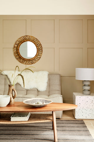
New Neutrals
The new neutrals palette is entirely natural encompassing the soft hues of stone to the warm tones of clay and terracotta. Inspired by artisan craft and slow living, these warm calming colours are perfect for creating comforting interiors.
These new neutrals are not about a return to boring beige or magnolia but an alternative to the cooler shades of grey that have dominated interiors for the last few years.
Equally smart and inviting, these gentle neutrals can be used in all areas of the home paired with organic materials and textures such as rattan, bamboo and linen, and artisanal elements like pottery and wood.

(Walls: Stone Pale Warm 34)
In bathrooms neutrals feel calm and serene, perfect for a long soak.

(Walls & roll-top bath: Rolling Fog colour scales)
And in bedrooms, deeper shades such as Little Greene Tuscan Red 140 or the new Nether Red 315 feel warm and cocooning.

(Walls: Nether Red 315)

(Walls: Tuscan Red 140 and French Grey 113)
Fresh Greens
Biophilia is a big trend this year as we seek to establish some balance between our technology-driven indoor lives and nature. House plants are everywhere bringing the outside in and purifying our air.

(Wall & dado rail: Sir Lutyens’ Sage 302 & Invisible Green 56)
Green is key with its inherent associations with nature, renewal and wellbeing. Just think of how good you feel after a brisk walk in the fields or forest, or a day pottering in the garden!

(Walls & woodwork: Puck 298)
Fresh greens offers a wide palette ranging from the restful soft sage tones, to rich olive hues, murky moss greens and dark forest greens.

(Walls: Book Room Green 322 & Green Stone Pale 268. Below dado rail: Sage Green 80)
Coming from nature means green will work harmoniously with most other colours for a timeless feel.

(Below dado rail: Invisible Green 56; walls & woodwork: Sir Lutyen's Sage 302; ceiling & coving: Blush 267)
And using bright greens as accents against neutrals feels invigorating in living spaces.

(Walls: Portland Stone Dark 157 and Chairs: Sage & Onions 288)
Delicate Pinks
The root of this trend sits with the strong desire, in our social media-driven lives, to always present ourselves in the best possible light.
Soft delicate pinks and warm nude tones cast a flattering, restful light for every kind of space, with sophisticated dusky shades sitting side by side with the sweetest rose, blush and baby pink hues.
In a study or WFH space soft pinks feel restful on the eye.

(Walls: Pink Slip 220)
In a kitchen a pale peachy pink injects warmth with blue or grey cabinetry.

(Walls: Light Peachblossom 3)
And in bedrooms, dusky nude pinks feel soft and feminine without being girlish.

(Walls: Ashes of Roses 6)
Solo Colours
With its roots in history, the trend for painting a room floor to ceiling in a single shade continues from 2020 when Pantone’s Colour of the Year was the regal Classic Blue.
Using rich dramatic shades, it celebrates the opulence of the Tudor era whilst offering the comfort of nostalgia in these uncertain times.

(Walls & woodwork: Paint & Paper Library Blue Blood)

(Walls, fireplace & panelling: Leather 191)
Key to this trend is creating texture within the one colour and using unusual paint finishes. For example, the use of matt paint on woodwork as well as walls for a rich, velvety feel, or lustrous gloss on the ceiling and walls for a luxurious, lacquered effect.

(Walls & woodwork: Cordoba 277)
Use in rooms where you want to curl up at the end of the day, pour a cocktail and watch a movie! Or create a sense of grandeur in an entrance hall with lighter rooms leading off it.
Colour Blocking
This trend is all about self-expression through the use of bold colour combinations that break with tradition. And it’s a trend to have fun with!
Energetic and full of life, colour blocking uses upbeat, dramatic cooler shades paired with complementary paler hues to elevate humble features such as floorboards or highlight architectural features and furniture.

(Floor: Air Force Blue 260; Skirting: Lamp Black 228; Walls: Wood Ash 229; Doors: Smalt 255)
Colours can be used to add vibrancy and vitality to a room, or to clearly demarcate open plan living spaces.

(Walls: Thai Sapphire 116 & Pale Lupin 278. Skirting picked out in Trumpet 196)
They can also be used to create interest in an otherwise bland space, such as picking out usually forgotten skirting boards in a contrast colour.
In fact, using such colour combinations brings to mind the bold Expressionist paintings of Paul Klee and Wassily Kandisky who distorted the image of reality to make it expressive of their inner feelings or ideas!

(Walls: Cape Red 279 & Mid Azure Green 96. Skirting & architrave: Lead Colour 114. Door: Trumpet 196)
Sky Blues
Our final trend is for pastel sky blues that can make a space feel both soothing and invigorating depending on the scheme.
Sky blues have always been popular for their versatility, from children’s rooms to sophisticated drawing rooms.
With crisp white sky blues create an airy coastal feel.

And when used as a block of colour, sky blues will feel like a breath of fresh air has been injected into the space.

(Image: Sofa.com)
The amount of natural light will change the colour too, especially in watery blue hues where the underlying green or grey tones will show through creating a mercurial effect.

(Walls: Celestial Blue 101)
Try with other pastel colours such as delicate pink or pale lemon, or with the warmer opposites of rust and terracotta to make these sky blues sing!

(Walls: Blue Verditer 104 & Stone Dark Warm 36)

(Walls: Grey Stone 276 & Light Peachblossom 3)
All imagery, except where noted, courtesy of Little Greene.
For help planning your colour scheme, or to order any of the little Greene paints featured, please contact us here or use the Chat with Us button.


 (Image: Ben Portreath x Morris & Co Queen Square Collection)


