Colour Trends for 2024
Posted: Nov 13 2023
With our love of natural colours continuing to nurture our mood since the pandemic, the 2024 colour palette takes its inspiration from nature. Look to colours that recall the natural world: be they calming or liberating, rich and warm, or light and airy. From delicate blues, pinks and lavenders recalling misty landscapes; to the warm neutrals of earthy clays; to the rich umber and ochre tones, and deep chocolatey browns of conkers and chestnuts! Whether you wish to create spaces that feel happy and joyful, or comforting and relaxing, these colours are central to personal self-expression within your home!
1. Tranquil Blues
In tune with our focus on health and wellbeing, the experts are forecasting a shift away from saturated dark blues towards refreshing, watery aquas and serene, pale blues and denim shades that create tranquil, meditative spaces.

2. Calming Lavenders and Lilacs
Soothing lavender is a soft, spiritual colour that’s been steadily growing in popularity in 2023. Calming and comforting, use it to create a tranquil space in a bedroom or bathroom. Choose warm or cool shades depending on the room’s orientation.

(Credit: Architectural Digest)
3. Delicate Earth Pinks
After a year of bright Barbie sugar pinks, the trend for soft earthy powder pinks continues. Little Greene has chosen “Masquerade 334” as their colour of the year for 2024. Ruth Mottershead, creative director of Little Greene describes the natural hue as a "timeless on-trend tone that brings a natural tranquillity into the home" making it perfect for bedrooms and living areas to create a warming glow in the morning and evening alike.

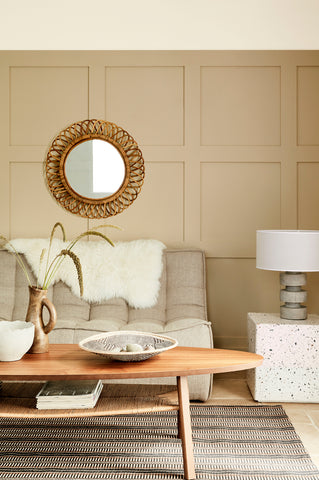
4. Warming Neutrals
Warm off-whites, warm beiges and buttery tones continue to replace the cooler greys of the last few years. They provide an easy way to layer softness and texture and work well with a variety of natural wood tones.
One of the practical reasons warm neutrals are making a resurgence is that they help balance out the cool light from LED lighting so prevalent in our homes! Try Little Greene’s mid-tone "Travertine 319", and warm off-white colour scales "Silent White 331" and "Silent White Deep 329" shown below.

5. Decadent Darks
The move towards rich, cocooning paint colours such as dark chocolate browns and mid chestnut tones provides a warming backdrop to the natural wicker, wood, and stone materials of our contemporary interiors. Little Greene has introduced a delicious palette of nine indulgent colours inspired by rich chocolate, honey and caramel desserts including Mochi, Bombolone and Galette. Yum! These colours are ideal where you want something dramatic yet warm, and where you might have previously considered using charcoal or navy blue in say a dining room, study, or TV room. Colour drench in graduating tones or pair with warm off-white neutrals for a more traditional feel.


Comments